Wes Ballao / Xerxes Aguilar

Brand
guidelines
01 — Our Brand

At DOER — we shape ideas into impactful outcomes through creative vision and hands-on excellence.

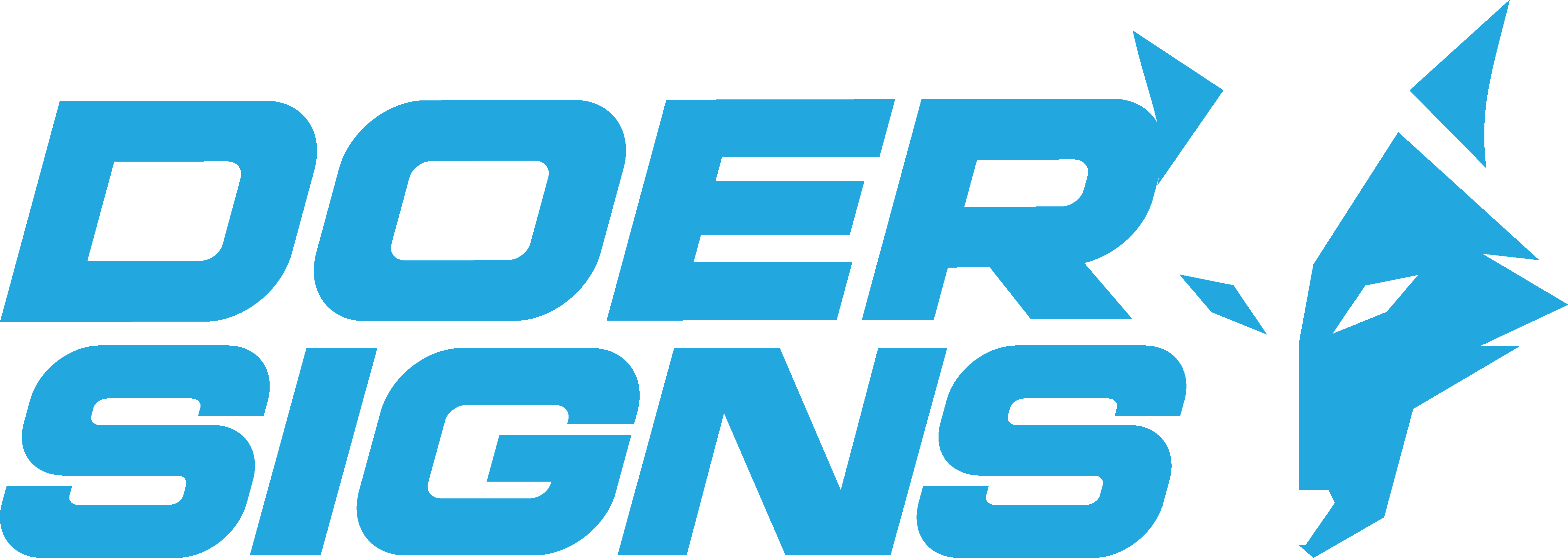
02 — Our Wordmark
Designed with versatility in mind, our custom typography captures our forward-thinking approach—its flowing forms and sharp details mirror our commitment to evolution and creativity.


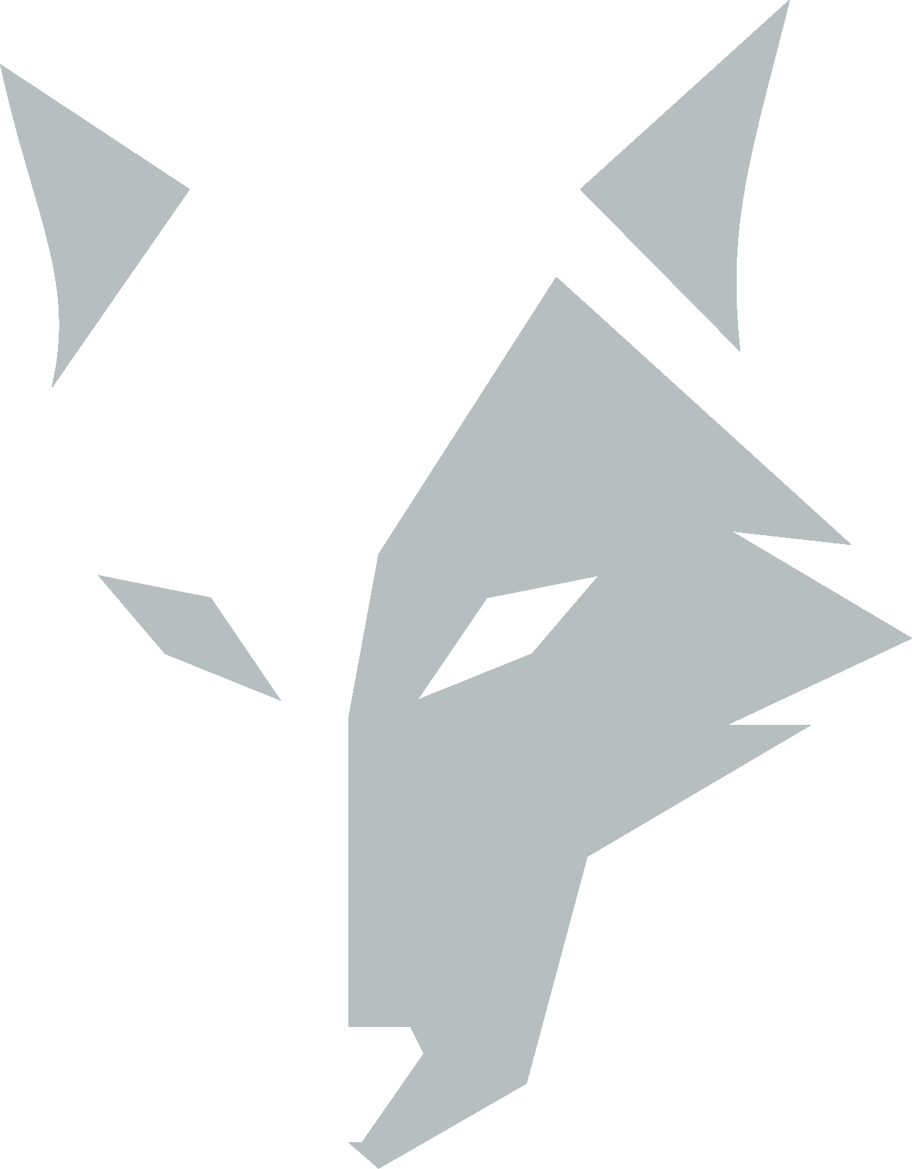
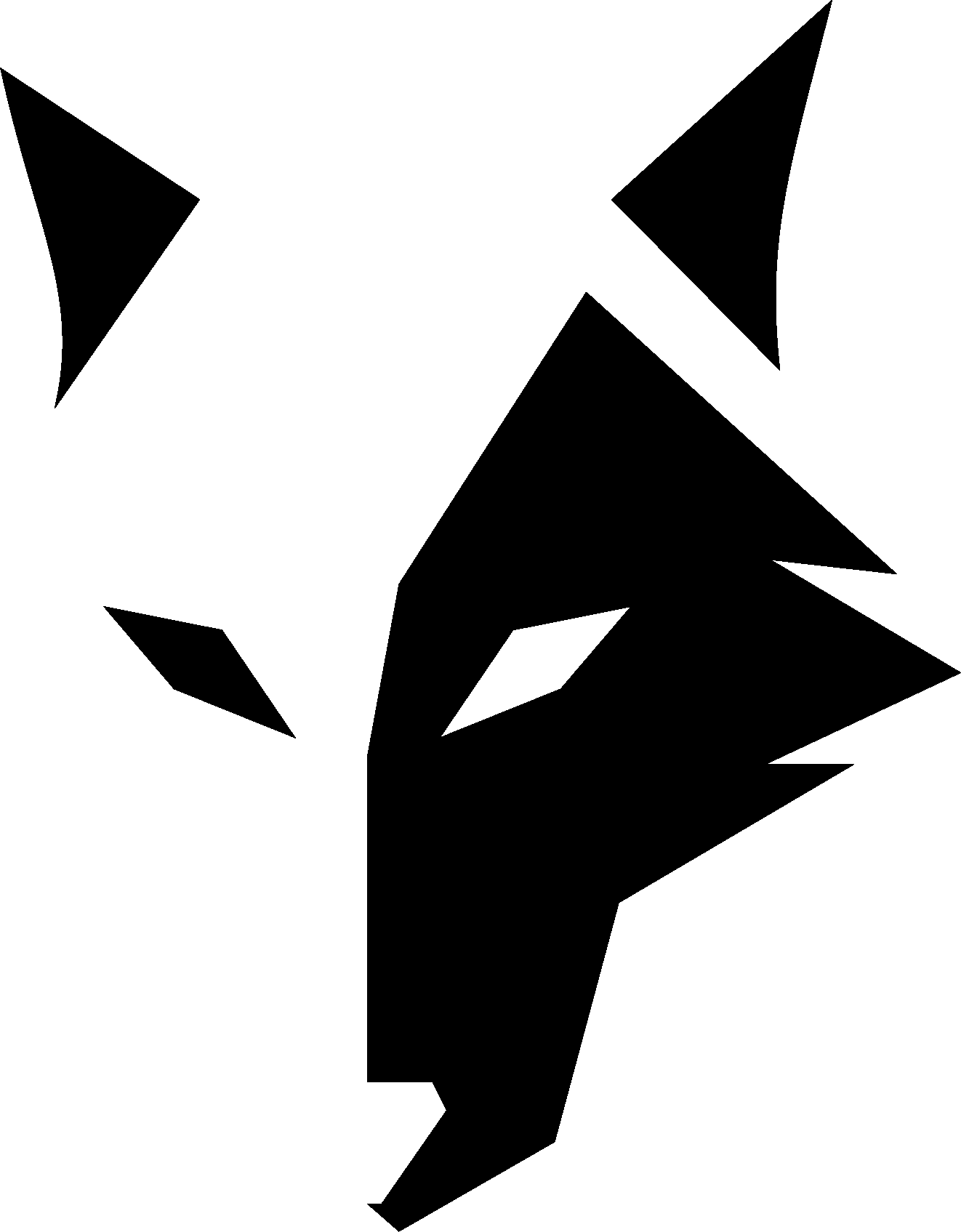
03 — Our Logomark
Our logo is a bold expression of our brand’s spirit—designed to embody our “Lead the pack” mentality and signal the confident, alpha presence we bring to the industry.


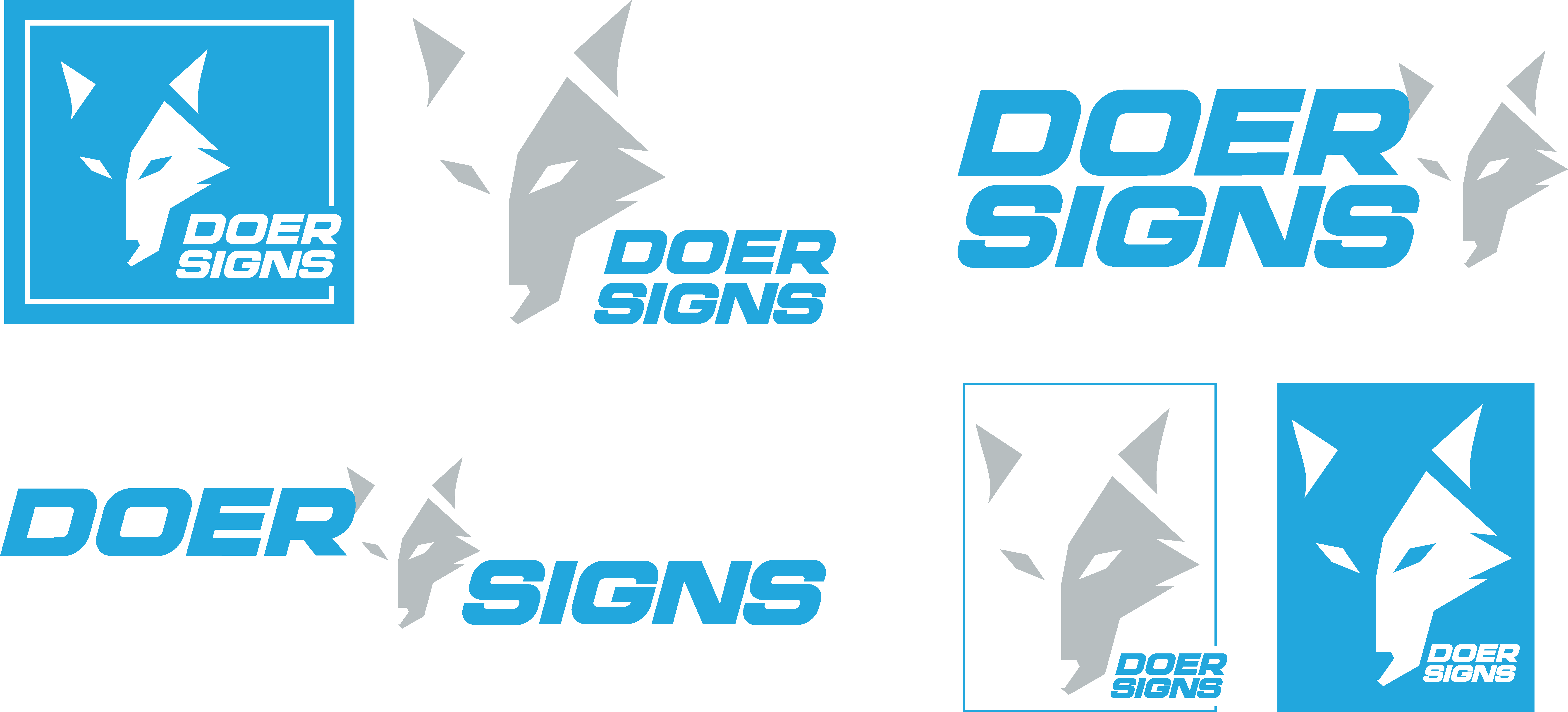
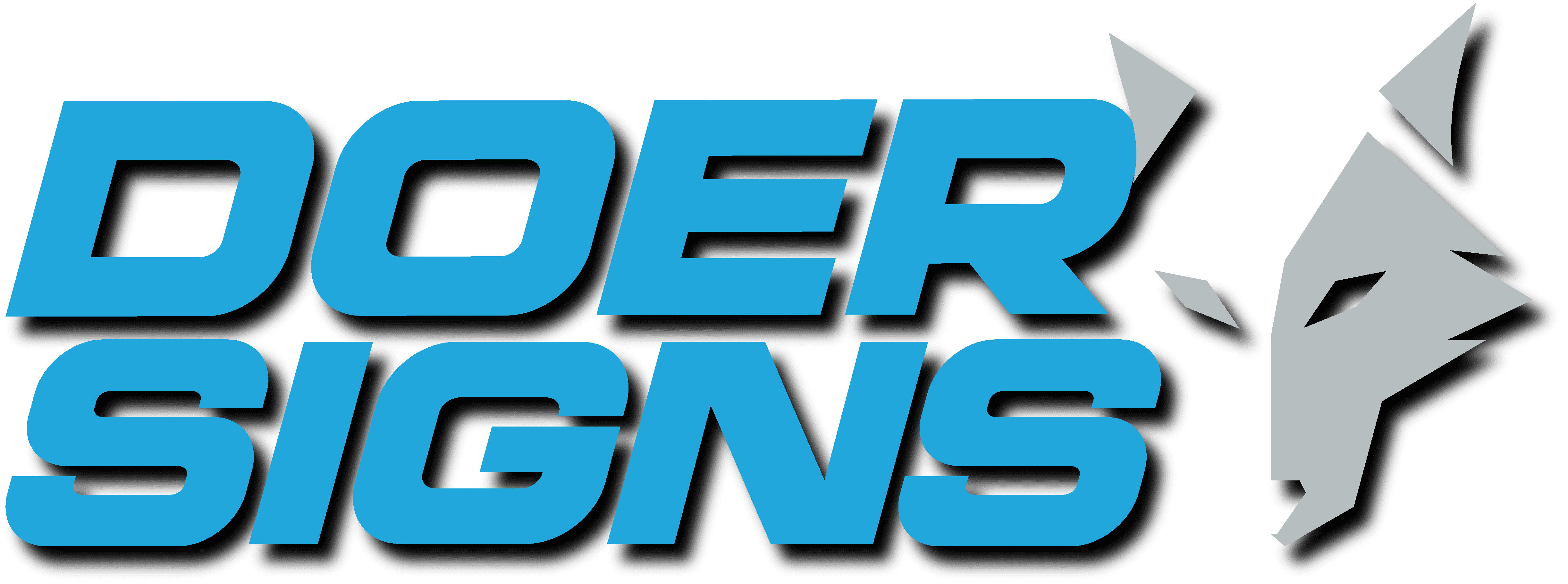
04 — The Primary Logo Lockup
This is the primary and standard format of our logo, representing the core identity of our brand. It should be used in most applications to ensure consistency and maximum brand recognition.

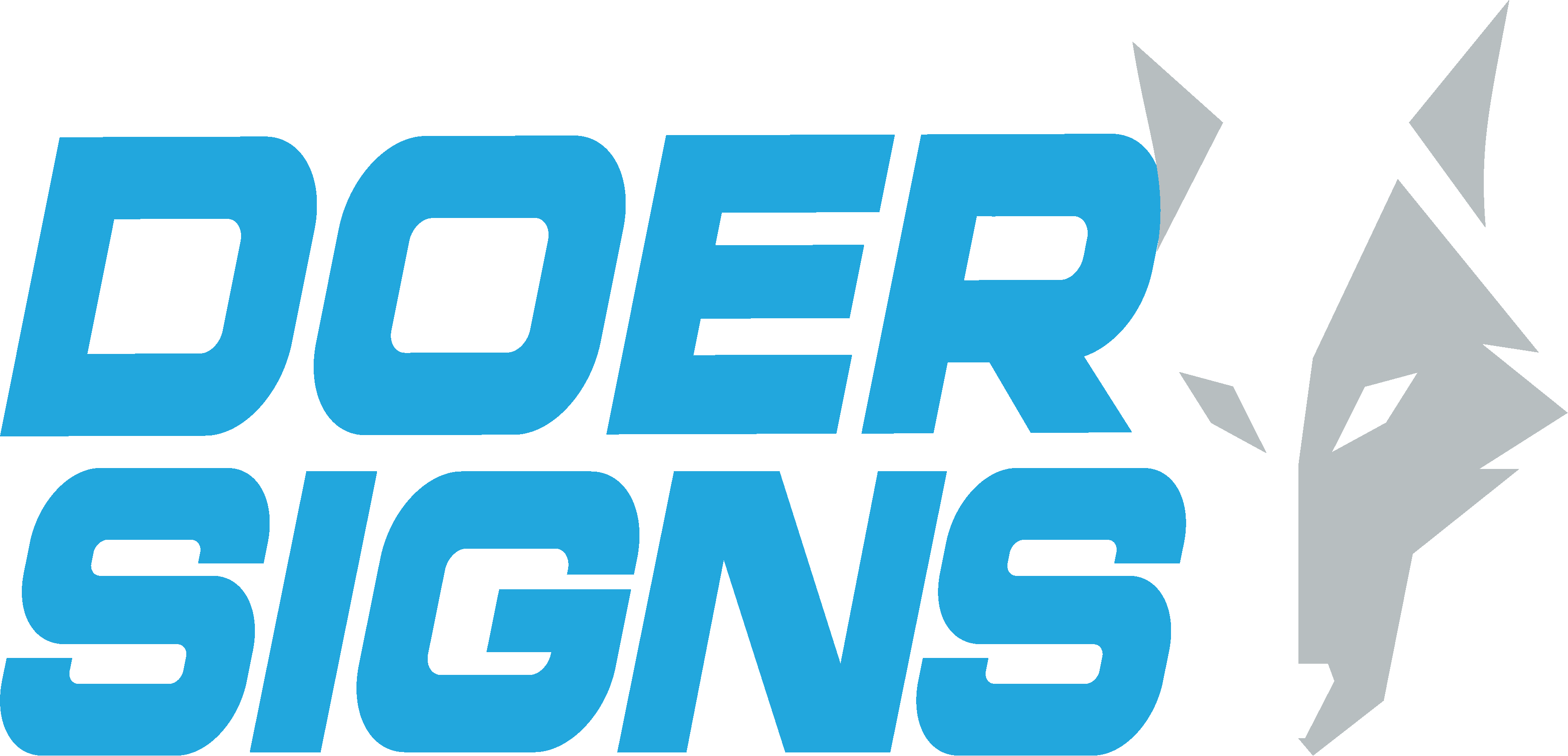
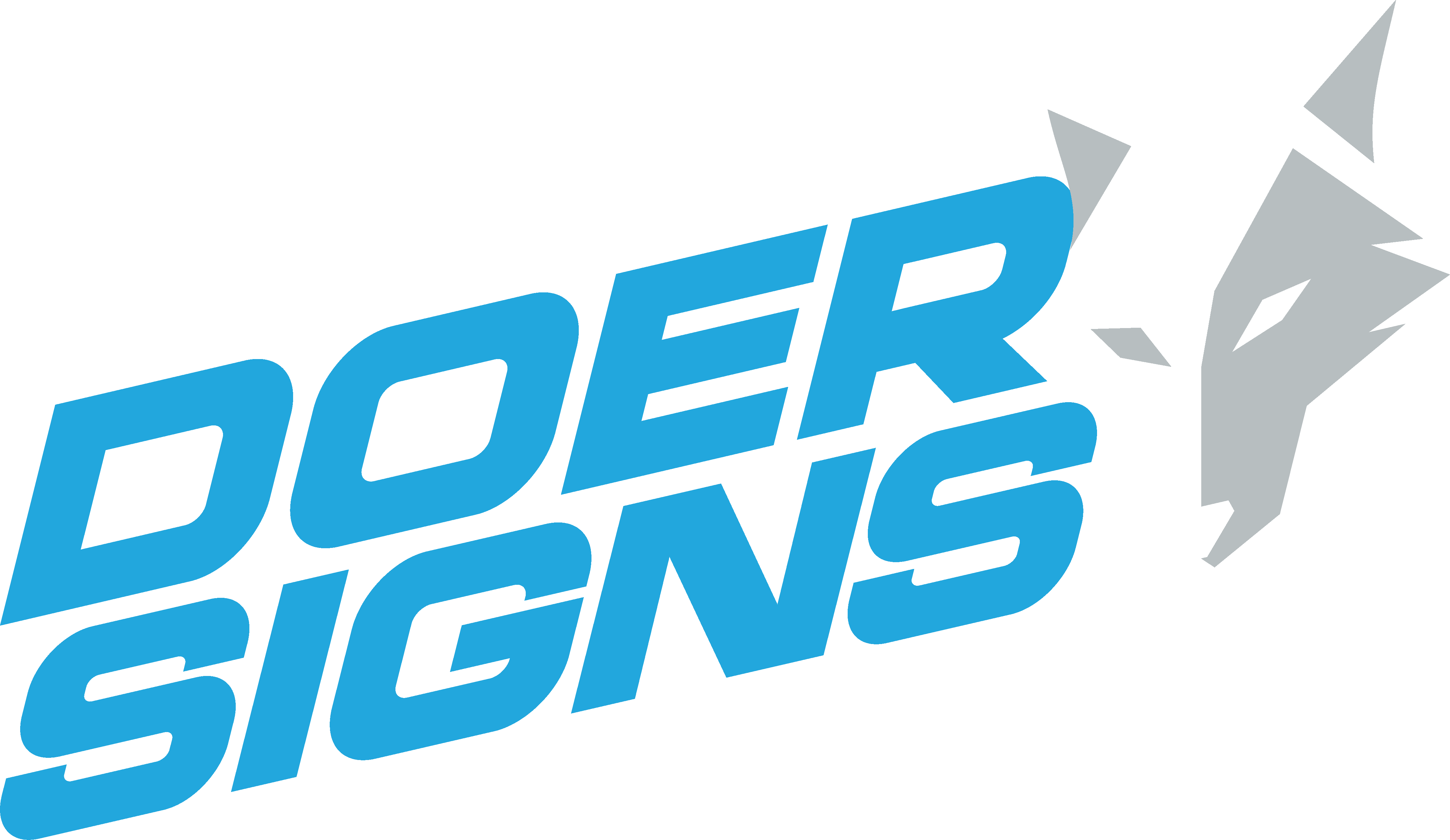
05 — Secondary Logo Lockups
These are the vertical and horizontal formats of our logo, designed to offer flexibility across different layouts and applications. Both variations maintain the integrity of our brand identity while ensuring optimal visibility and impact in diverse formats, whether used in print, digital, or physical environments.
06 — Typography
Our brand fonts are thoughtfully selected to embody our brand personality, resonate with our target audience, and ensure versatility across a wide range of applications. They enhance readability while maintaining a distinctive and cohesive visual identity.
Work Sans Regular Character Set
ABCDEFGHIJKLMNO
PORSTUVWXYZ
abcdefghijklmno
parstuvwxyz
1234567890
Work Sans Bold Character Set
ABCDEFGHIJKLMNO
PQRSTUVWXYZ
abcdefghijklmno
parstuvwxyz
1234567890
07 — Colors
Our primary brand colors—blue, grey, and white—reflect our leadership in advanced LED technology. Blue signifies innovation and trust, grey adds sophistication, and white highlights clarity and precision.
81C 10M 1Y 0K
34R 168G 223B
WEB = #22A8DF
PANTONE® 299C
0C 0M 0Y 100K
0R 0G 0B
WEB = #000000
Black
29C 18M 20Y 0K
183R 190G 192B
WEB = #B7BEC0
PANTONE® 428 C
08 — Logo Do's and Dont's
❌
Do not stretch/compress/distort our logo.
❌
Do not stretch/compress/distort our logo.

❌
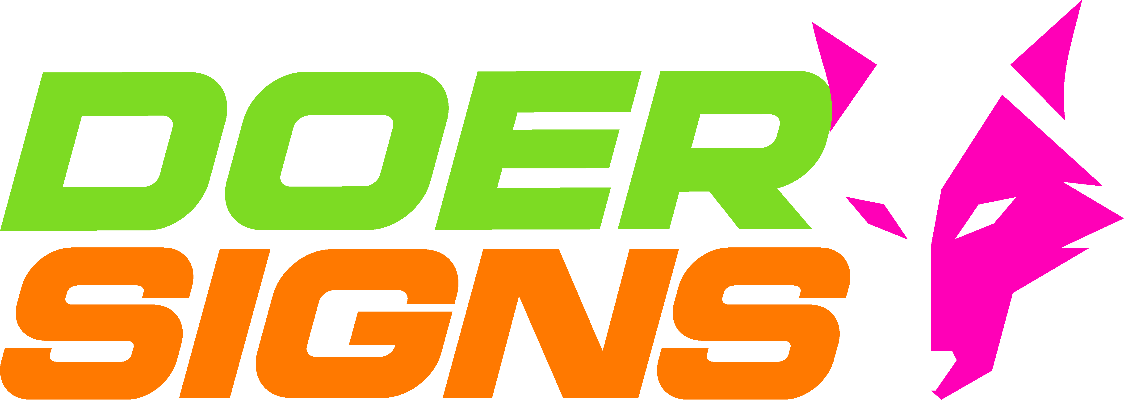
Do not use different colorways for our logo.

❌
Do not dissarrange our logo lockup.
❌
Do not apply any effects on our logo.
❌
Do not use multiple/unapproved colors for our logo.
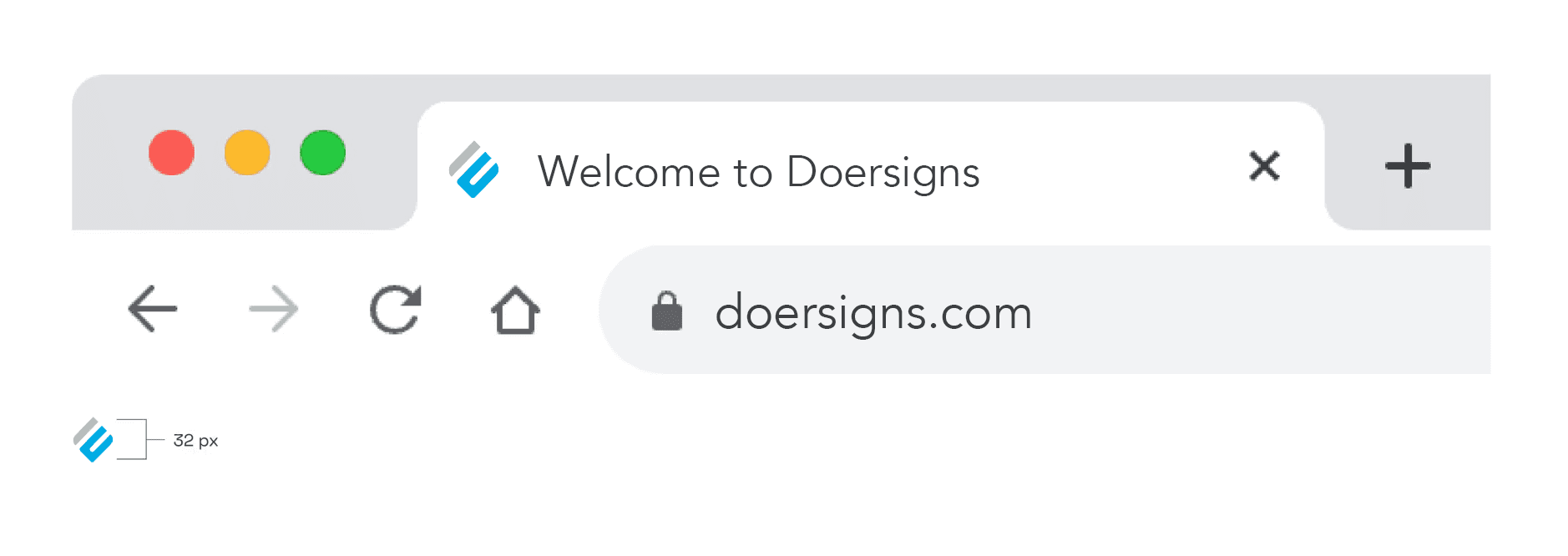
09 — Logo Minimum Size
A key use case for our logo’s minimum size is as a favicon. To maintain legibility at smaller sizes, the logo should never be scaled below a height of 32px.
Please ensure the logo is not reduced smaller than this to preserve clarity and brand recognition.